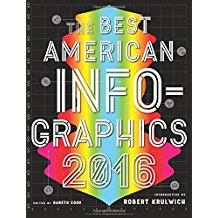
Best American Infographics: 2016, ed. Gareth Cook, 2016
Part of the ‘Best American….’ series, this is the fourth volume of Best Infographics, and it’s a wonderful discovery. Drawing upon the latest advances in big data and computer software, these 64 infographic entries present striking, creative methods for portraying information in visual form. The topics are incredibly diverse but the bottom line is the same in every one: dull numbers, boring data, overwhelming amounts of information, and complicated conclusions can all be presented effectively and clearly by the use of graphic approaches. Whether you are examining the Democratic/Republican split among occupations or the cost of crime in city blocks in Chicago, the visual provides a concise and manageable way of presenting data and reaching a conclusion. That being said, there were many of the presentations that were unreadable to this 71 year old’s eyes. The book has a large format but even that was insufficient for many of the very small print fonts and data points. Particularly striking chapters were ones which examined the 2016 presidential race candidates arraying their use of language on a graph with simple/complex words on the y-axis and positive/negative words on the x-axis and using the same software to analyze a range of books drawn from Project Gutenberg. Not surprisingly, Trump was the candidate using the most simple words and was slightly to the ‘positive’ side of neutral, mostly due to his praise of himself. The literary works closest to his ‘style’ were (again not surprisingly) Hans Christian Anderson’s Fairy Tales and The Legends of King Arthur. There were many sobering graphics as well, perhaps the most arresting was one entitled The Human Toll of World War II which graphically depicted the unbelievable total of 70 million deaths according to civilian/soldier, the year they occurred, and the nation enduring those deaths. An animated 18 minute film with this information is accessible via a web site provided in the chapter. My two favorite presentations were those consistent with two of my OCD activities. One, A Year in the Life of the Data Artist, used an array of commercially available applications and devices that logged information about the author’s car, computer, location, environment, media consumption, sleep, activity and physiology to provide data for him to document his year in excruciating detail. Fascinating and weirdly scary stuff! The other chapter I loved was Dear Data in which two graphic artists, one in Brooklyn and one in London, sent each other a postcard every week! The front of the postcard was a visual depiction of the week’s theme while the message side explained the theme. For example, the week 7 postcard entitled A Week of Complaints, involved the sender keeping track of all of her negative comments during the week and categorizing them (e.g. weather, husband, money, etc) and then color coding the categories. The front of the card used colored lines radiating from a central point to depict the number of color coded complaints. Complex: yes. Incredibly creative: yes! And another fantastic use of POSTCARDS. This is a fascinating series and one which I will now follow every year as I do the Best American Essays, Best American Poetry, and occasionally, the Best American Short Stories.


